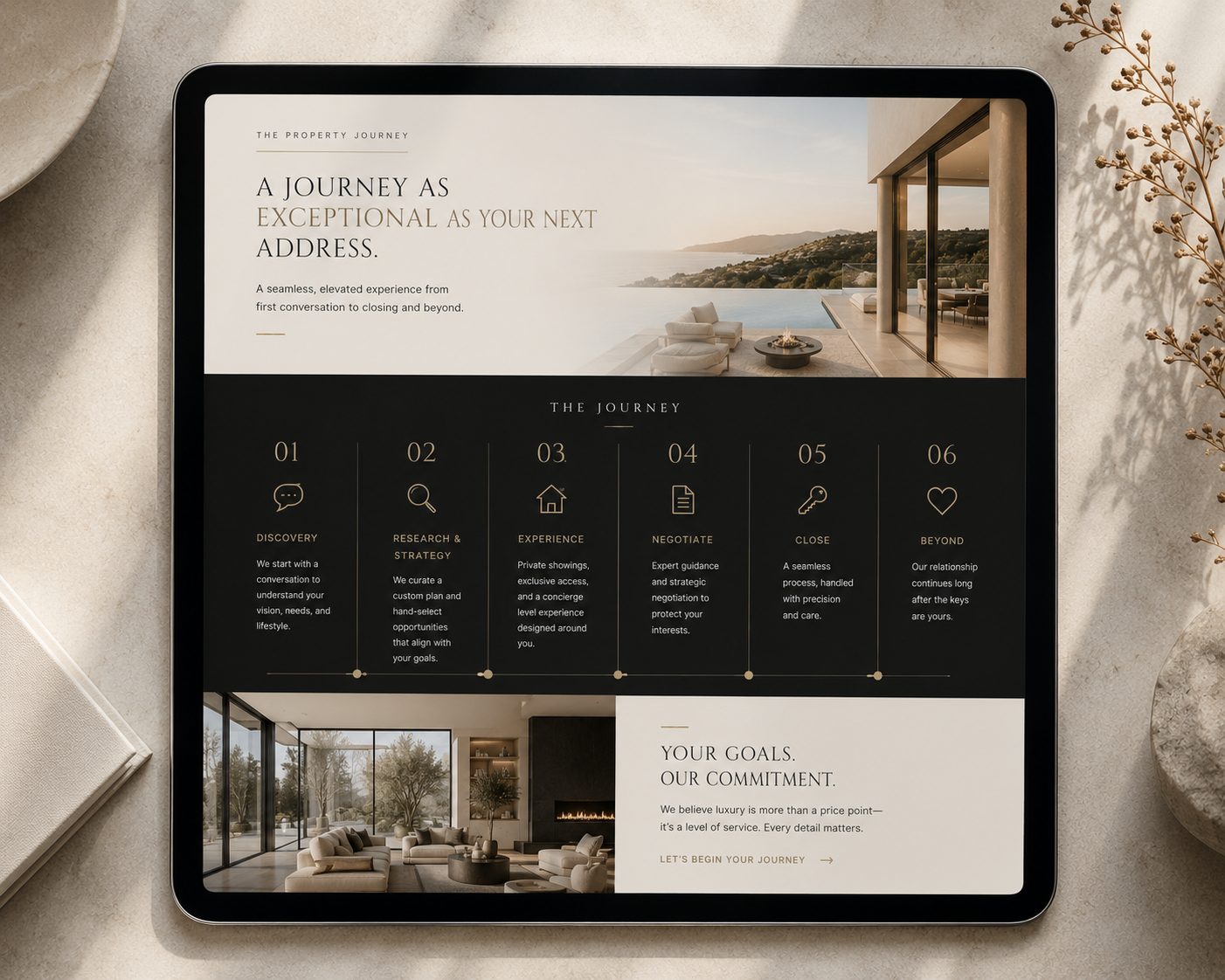
Plenty of real estate websites are attractive. Far fewer are built to convert, meaning built so that the right visitor takes the next step, whether that step is booking a consultation, requesting a home valuation, or picking up the phone. The difference is rarely one dramatic feature. It is a series of small, deliberate decisions about what appears on the page, in what order, and why.
Here is what actually earns its place on a high-converting real estate website, section by section.
A hero that answers three questions in five seconds
The top of your homepage has one job: orient the visitor instantly. Who are you, where do you work, and who do you serve best? A strong hero pairs a confident headline with imagery that feels like your market, not a stock photo of a city you do not sell in.
The headline should speak to the client, not the industry. "Helping Sioux Falls families move up with confidence" tells a visitor more than "Your trusted real estate professional," which tells them nothing at all. Beneath it, one button. One. The visitor who is ready should never have to hunt.
A valuation or consultation offer that respects the visitor
Home valuation tools are popular because sellers love them, but how you frame the offer matters. An invitation that reads like a service ("Curious what your home is worth? Request a personalized valuation") converts better over time than one that reads like a trap for contact information. Ask for the minimum you need. Every extra form field is a place where someone changes their mind.
Social proof placed where doubt appears
Testimonials work hardest when they are positioned next to the claims they support. A quote about your negotiation appearing beside your selling process, a first-time buyer's words near your buyer services page. Names and context make them credible; a wall of anonymous five-star snippets does not. And they must be real. Invented praise is not just an ethics problem, it is a conversion problem, because visitors can feel manufactured enthusiasm a mile away.
A sold gallery that lets prospects see themselves
Buyers and sellers scan your track record looking for one thing: evidence that you have done this for people like them. Organize sold properties by neighborhood and property type rather than as one endless grid. A seller in a lakefront home wants to see lakefront sales. A downsizing couple wants to see that you have handled that transition before. Each property page, even after the sale, keeps working for you in search results and in listing presentations.
Service pages that explain the experience
A page for sellers and a page for buyers, each walking through your process step by step, does two quiet jobs. It answers the questions people are too polite to ask, like what you actually do for your commission. And it filters for fit, attracting the clients who want the way you work. Write these pages in plain language, in your voice. This is where a visitor decides whether working with you sounds like a relief or a chore.
Neighborhood pages that earn search traffic
If you farm specific communities, dedicated neighborhood pages are among the highest-return pages you can publish. They match the searches real people type, like the name of a subdivision plus "homes for sale" or "real estate agent." They demonstrate depth no generalist can fake: school context, price trends, what living there is actually like. Written well, these pages become the way strangers in your farm area find you without a referral.
An about page that closes, not just introduces
Visitors read your about page late in their decision, usually right before contacting you, which means it should be written like the final step of a conversation. Yes, include your background and credentials. But spend most of the page on how you work: how often clients hear from you, how you handle pricing conversations, what you do when a deal gets complicated. The about page is where a hesitant prospect becomes a scheduled appointment.
One call to action, repeated calmly
The biggest conversion mistake on agent websites is not a missing button, it is competing buttons. Schedule a call, download a guide, join the newsletter, follow on social, get a valuation, all shouting at once. Pick the action that matters most to your business, make it the primary button sitewide, and let everything else be secondary. A visitor should never wonder what you would like them to do next.
Speed, mobile, and the unglamorous technical layer
Most of your traffic is on a phone, often on a mediocre connection, standing in a driveway. If the site loads slowly or the menu fights their thumb, none of the strategy above gets a chance to work. Fast load times, clean mobile layouts, readable type, and accessible contrast are not design luxuries. They are the price of entry, and search engines treat them that way too.
Behind the scenes, the same discipline applies: proper heading structure, descriptive page titles, image alt text, and a site architecture that search engines can crawl without confusion. None of it is visible to your clients. All of it determines whether your site is found.
What to leave off
Converting sites are as notable for what they exclude. Auto-playing video with sound. Pop-ups that appear before the page finishes loading. Widgets pulling in third-party content that slows everything down. Long paragraphs of industry jargon. Every element should either build trust or move the visitor forward. Anything that does neither is friction wearing a costume.
A market presence that signals life
One more element separates the sites that convert from the ones that merely exist: evidence of a working agent. A short market update, a recent sale announced, a note about a neighborhood event. It does not need to be a publishing empire; a monthly rhythm is plenty. Visitors checking you out want to see momentum, and a site last touched two years ago whispers the wrong answer. Search engines read the same signal. Fresh content on a real cadence tells both audiences that this agent is active, current, and busy in exactly the market they care about.
There is a compounding effect here that agents rarely anticipate. Each market update becomes a page that can rank for local searches. Each announced sale strengthens the sold gallery. Twelve months of modest consistency builds a body of proof that no burst of activity can replicate, and it becomes one more thing a competing agent cannot copy by launching a prettier template.
How it comes together
At The Agency, real estate sites are designed section by section against exactly this standard: every block on the page has a stated job, and anything without one is cut. Strategy and copy come first, then design that gives the content room to breathe, then a build measured against speed and search fundamentals. Projects typically run six to eight weeks from kickoff, so an agent heading into a busy season can plan backward from a launch date.
A website like this does not just collect leads. It compounds. Every sold property, every neighborhood page, every real client story added over time makes the whole site more persuasive and more visible than it was the month before.
If your current site is attractive but quiet, that gap is fixable. Reach out through the contact page with a little about your market, and The Agency will be in touch.