Walk into a well-run med spa and you can feel the intention everywhere: the lighting, the scent, the way the front desk greets you, the weight of the robe. Owners invest enormously in that experience because they know clients are buying confidence as much as treatments. Then many of those same practices represent themselves online and in print with a logo made in a weekend and a color scheme borrowed from a template, and wonder why price shoppers keep filling the phone lines.
Your brand is the experience, translated into everything a client sees before and between visits. When the two match, premium pricing feels natural. When they do not, you end up discounting your way into rooms your work should have filled.
Clients read design as a clinical signal
Prospective med spa clients cannot evaluate your technique from the outside. They cannot see your training, your product quality, or your safety protocols. So they evaluate what they can see, and what they can see is design: your website, your Instagram grid, your signage, your gift cards, your treatment menus. Polished and cohesive reads as careful and expert. Cluttered and inconsistent reads as improvised, and nobody wants improvisation near their face.
This mapping is not superficial on the client's part. It is a reasonable heuristic in a field where the stakes feel personal. Which means design quality is not a marketing nicety for a med spa. It is evidence, and you control every piece of it.
The anatomy of an elevated aesthetic brand
Strong med spa brands tend to share a handful of traits, and none of them is a trend.
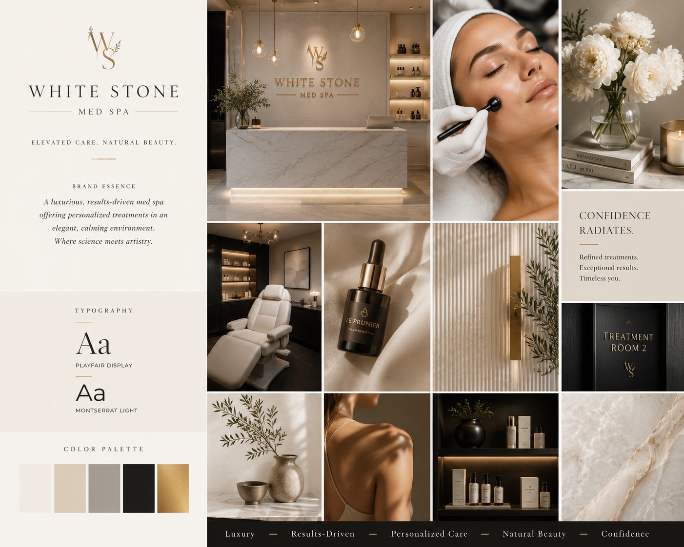
A distinctive but restrained identity. The logo is refined and quiet. The palette is drawn from a narrow, intentional range that photographs beautifully next to skin tones and interiors. Typography does heavy lifting: an elegant serif or a clean modern sans, used consistently, signals far more than ornament ever could.
Photography as the centerpiece. Real images of your space, your team, and, with consent, your clients. Aesthetic medicine is a visual business; generic stock models undercut the very results you sell. A professional shoot is among the highest-return brand investments a med spa can make, because those images work everywhere for years.
A voice that is warm, expert, and unhurried. The strongest aesthetic brands never plead and never pressure. They educate, reassure, and invite. That voice should be recognizable in web copy, captions, emails, and the way treatment descriptions are written.
Consistency without exception. The brand on the website matches the brand on the booking confirmation, the gift card, the retail shelf talkers, and the sign on the door. Every consistent touchpoint deposits trust. Every inconsistent one withdraws it.
Positioning: decide what you are the best at
Under the visuals sits a strategic question many practices skip: what is this med spa for, and for whom? "Everything for everyone" is the default position and the weakest one. The practices that command loyalty stand for something specific: natural-looking results and a light hand, or medical-grade skin transformation, or a sanctuary experience for busy professional women, or the trusted place for first-timers who are nervous and need honesty.
Choosing a position does not mean turning clients away. It means your marketing finally has a message, your team has a story to tell, and your ideal client recognizes herself immediately. Pricing power follows positioning: clients pay premiums to specialists and negotiate with generalists.
Where the brand lives: your website
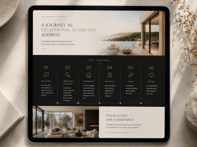
Every branding decision converges on the website, because that is where prospective clients spend the most focused time with you before booking. A brand refresh that stops at the logo leaves the most important room unrenovated. The site is where your palette, photography, voice, and positioning combine into an experience: treatment pages that educate in your tone, provider bios that build trust, galleries that show real results tastefully, and a booking path that makes the first step feel easy.
This is also why identity and website belong in one engagement rather than two disconnected projects. When the same strategy drives both, the client journey is seamless from the first Instagram touch to the booked consultation.
What elevated brands refuse to do
Restraint is half of luxury. The med spa brands that hold premium positions are defined as much by what they decline: constant discounting that trains clients to wait for sales, urgency tactics and countdown timers that cheapen the experience, copy built on fear of aging rather than confidence and self-care, and borrowed trends that will date the brand in eighteen months. None of that belongs near a practice that intends to charge what its work is worth.
Honesty is the other half. Real reviews, real photos, real credentials. In a trust business, a single fabricated element costs more than a hundred authentic ones earn.
Rebranding an established practice
If your med spa has grown past its original look, you are sitting on the good problem: a reputation stronger than its packaging. A thoughtful rebrand does not erase what clients love; it translates it. The process worth doing starts with strategy, who you serve best, what you want to be known for, where your market has room, then builds the identity, and then carries it through the website and every client touchpoint in one coherent push.
That is how The Agency structures aesthetic branding work: positioning first, identity second, website third, so nothing gets designed before it has a job. Branding typically adds a few weeks ahead of a site build, and the result is one continuous experience from search result to treatment room.
The retail and gifting layer most practices miss
Brand does some of its best work in the smallest formats. Gift cards, retail packaging, aftercare cards, the bag a client carries out: these travel into homes, offices, and birthday envelopes, each one a tiny advertisement aimed at exactly the right audience, the friends of your current clients. A beautifully designed gift card gets given more often, and a cohesive retail shelf raises the perceived value of everything on it. Practices that extend their identity into these touchpoints turn ordinary transactions into referral instruments, at a cost that rounds to nothing next to advertising.
The same logic applies to the digital equivalents: the booking confirmation email, the appointment reminder, the follow-up message. Each is a brand touchpoint that most practices leave in default templates. Ten minutes of intention in each turns administrative noise into another consistent deposit of the feeling clients come back for.
The return on looking like what you are
When your brand finally matches your caliber, several things tend to happen quietly. Price objections soften, because everything the client sees supports the number. Referrals come pre-sold, because your materials confirm what their friend told them. And the clients you attract skew toward the ones you most want: people seeking quality, not coupons.
There is also a team effect owners rarely predict. Providers and front-desk staff who work under a brand they are proud of talk about the practice differently, share it more readily, and hold the experience to the standard the materials set. A strong identity does not just recruit clients. It recruits the people who serve them, and it gives everyone in the building the same picture of what this practice is at its best.
If your practice has outgrown its look, The Agency would love to see where you are and hear where you want to be. Reach out through the contact page, and The Agency will be in touch.